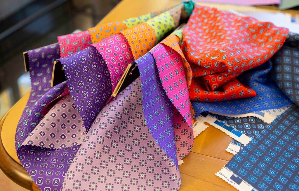
Colour is one of the most powerful elements in fashion and accessory design. It defines style, conveys emotion and influences consumer choices.
In textile printing, colour plays a crucial role, transforming simple materials into unique and memorable fashion garments and accessories. Choosing the right colours can make the difference between a garment that goes unnoticed and one that catches the eye.
Papis has the ability to create fabrics with vibrant and lasting colours that are always on trend and in step with the needs of the global market. In this article, we explore the process of colour selection and application in textile printing, including innovative technologies and collections with striking colour palettes.
Colour selection and application in printed textiles
Choosing the colour palette in a textile printing project requires a combination of creativity and technicality. Each shade is carefully selected to ensure that it matches the fabric perfectly and retains its intensity after the printing process.
Colour selection often starts with global fashion trends, which strongly influence seasonal collections. The dominant shades for each season are then adapted to create unique visual effects on fabrics such as silk, cotton, linen or synthetics.
1. Study global Trends
Before you start printing, it is essential to monitor global colour trends. Agencies such as Pantone and the fashion weeks in Paris, Milan and New York offer insight into the most popular shades. This step helps fashion and design brands stay relevant by offering collections aligned with contemporary tastes.
2. Adapt colours to materials
Not all fabrics react in the same way to colours. Silk, for example, tends to enhance bright tones due to its natural sheen, while cotton, while absorbing dyes well, offers a more opaque and softer rendering. The choice of colours is, therefore, adapted according to the type of fabric, to achieve the best visual and tactile result.
3. Experimenting and prototyping
Once the tones have been selected, printing trials are carried out on small quantities of fabric to check the final performance of the colours. These tests allow the shades to be refined and ensure that the colour palette meets the expectations of designers and customers.
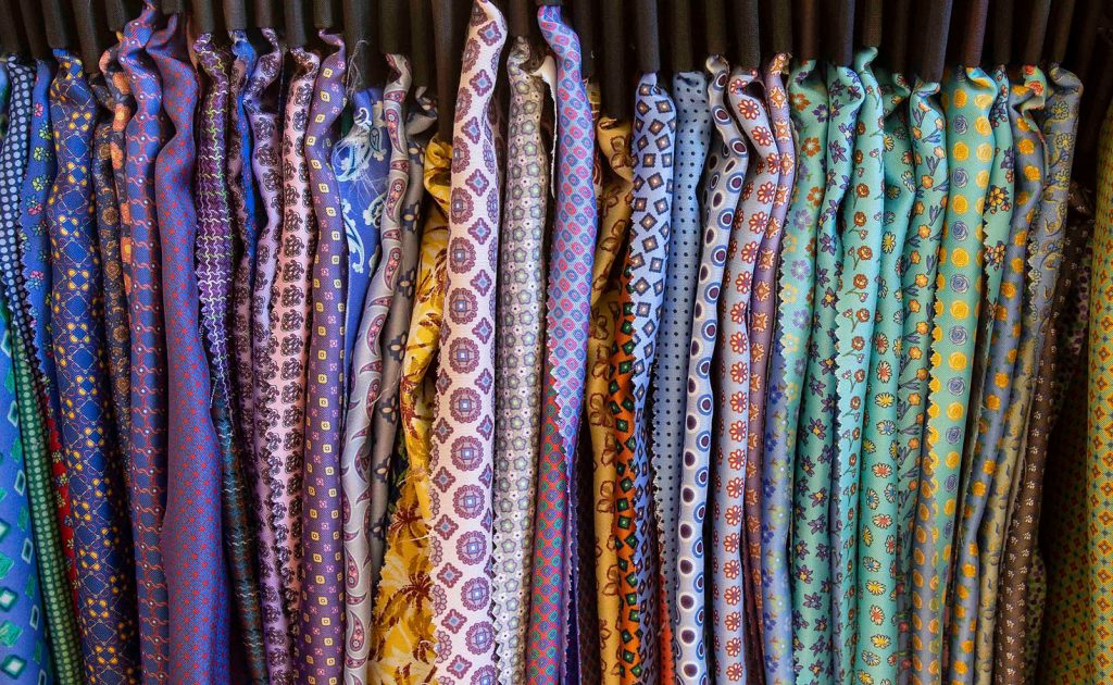
Using technology to create vibrant, long-lasting colours
To achieve vibrant and long-lasting colours, it is essential to use innovative printing technology and high quality inks .
Papis uses advanced digital printing techniques to imprint accurate and brilliant colours on a wide range of materials.
1. Direct digital printing
Direct digital printing allows for impeccable colour results, as it enables precise control over the amount and density of ink on each part of the fabric. This technique is particularly effective for printing complex, multi-coloured designs, ensuring uniform, detailed output.
2. Environmentally friendly and durable inks
Papis uses water-based or eco-friendly inks, not only to ensure environmental sustainability, but also to ensure that the printed colours are durable and resistant to washing. The inks are chosen for their ability to maintain the vibrancy of the colours, even after intensive use and frequent washing.
3. Colour correction techniques
Another important aspect in digital textile printing is colour calibration. Through colour management techniques, Papis is able to accurately adjust shades to achieve exactly the desired hue, avoiding unwanted colour variations between different batches of fabric.
Innovative colour palettes and collections
In recent years, several fashion and accessory collections have emphasised the power of colour in textile printing. Here are some examples of palettes that make the most of the colour potential offered by textile printing.
- Pastel shades for Spring-Summer fashion: Delicate tones such as powder pink, mint green and sky blue characterised several spring collections. Their lightness was emphasised by the use of fabrics such as silk and linen, on which these colours create an ethereal and sophisticated effect.
- Earthy palette for Autumn-Winter design: Browns, ochres and shades of burnt red dominated the autumn collections, evoking the warm and cosy atmosphere of the season. Printed on cotton and wool, these colours gave depth and character to garments and accessories.
- Colour contrasts for minimalist collections: In contrast to the more muted palettes, some collections chose to dare with bold combinations of contrasting colours such as black and neon yellow, electric blue and scarlet red. On technical and sporty fabrics, they emphasised contemporary design and fashion innovation.
Colours making the difference: Papis and colour in textile printing
Thanks to the use of advanced technologies and constant attention to global trends, Papis is able to offer printed fabrics with vivid colours, resistant and in line with the needs of the fashion market. The company’s experience and expertise allow for customised colour palettes that guarantee maximum quality and durability. Whether silk, cotton or technical materials, Papis guarantees excellent results in terms of colour rendition and durability.
Colour is an essential component of textile printing and has the power to define the identity of a garment or accessory. Through advanced printing techniques and careful colour selection, Papis helps designers transform their vision into reality, ensuring high-quality, vibrant and durable printed fabrics.
